
")
Prettiest packages, cult-iest following, top-notch artistry… what’s not to love? Makeup artist Fara Homidi’s eponymous beauty brand is one of the industry’s most exciting innovators of late. Now, she’s looking at your eyes.
 Courtesy of Fara Homidi
Backstage at the Erdem show in London, creative director Erdem Moralıoğlu is celebrating two decades since the brand’s inception. He’s surrounded by love – models that symbolise the past, present and future of one of London’s mainstay independent brands, a starry FROW, and backstage, a carefully selected line-up of collaborators who have helped bring his world to life for several seasons. On the beauty side, that’s embodied by MUA Fara Homidi, who also happens to be one of the industry’s coolest names right now. Splashed across the vanities is her eponymous beauty brand – again, one of the coolest out there today.
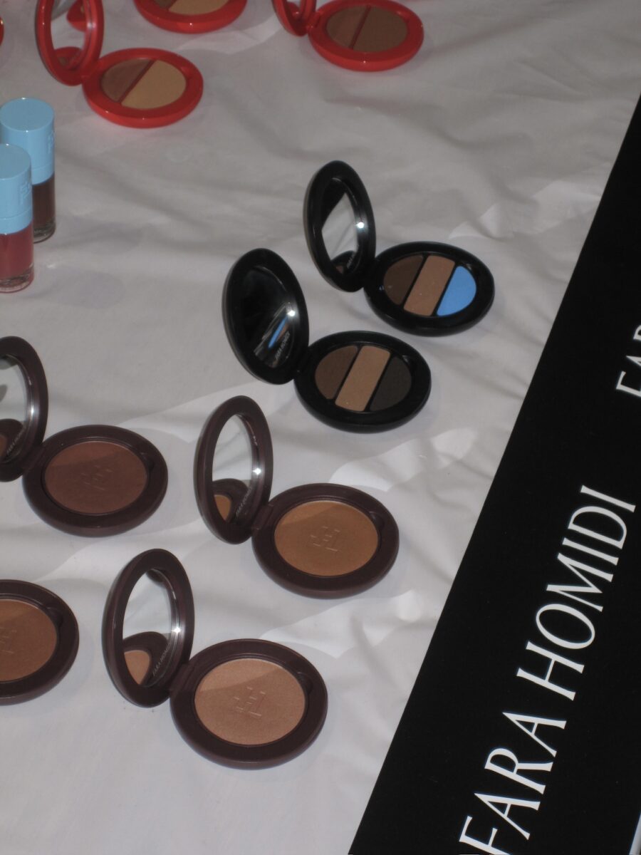
Launched in 2023, Homidi’s beauty brand is the culmination not only of years of expertise working backstage as a makeup artist, but also the vision of someone who truly understands what luxury means in today’s world. Looking at her products, you might first notice how visually pleasing they are. But it’s when you touch them, holding the weighty cases in your hands, that you realise the intention poured into their development. Fara Homidi’s formulas are for someone who lives in real life: extremely easy to apply, perfect to live in your beauty bag on the go, adaptable across different skin tones and temperatures, and never made with the idea of perfection as a final destination.
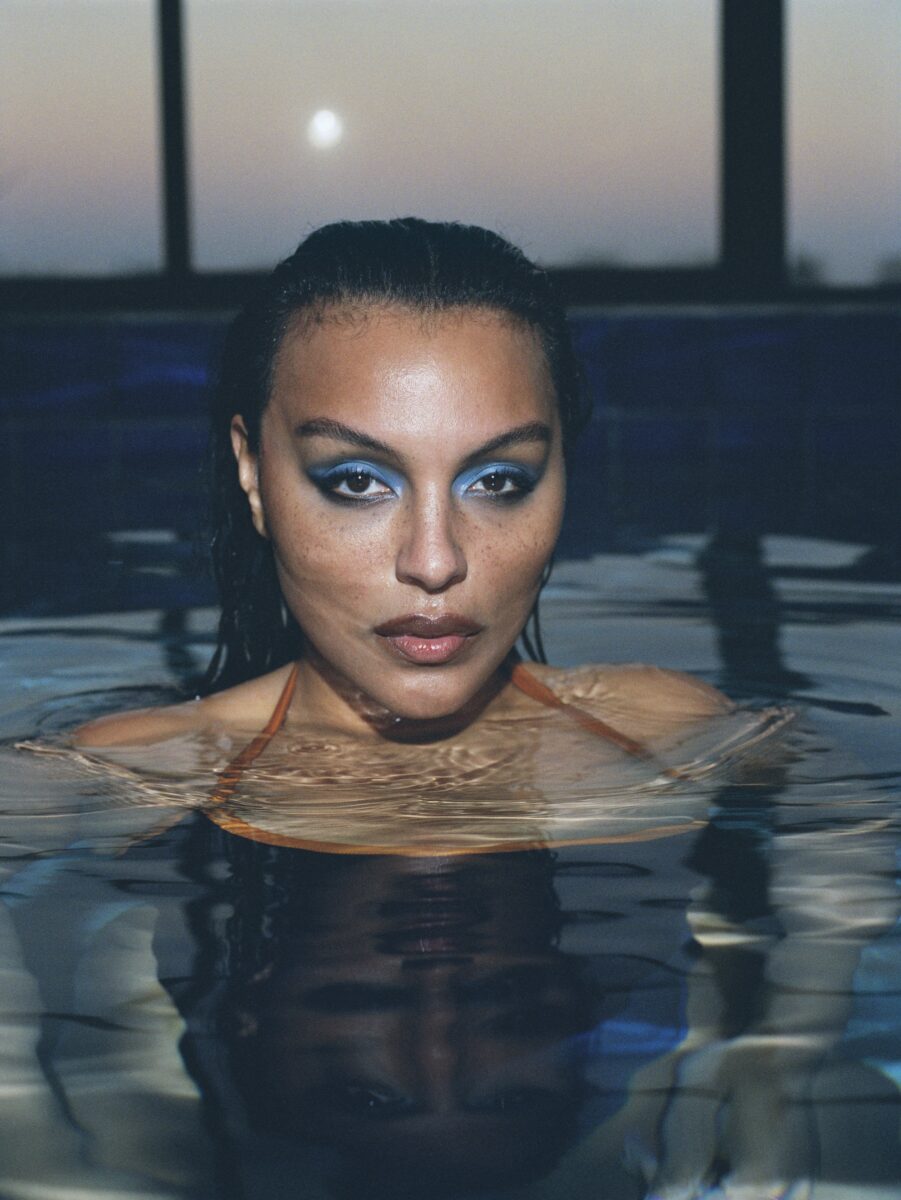
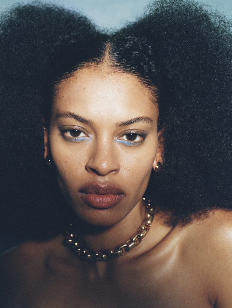
They’re beautiful, but utilitarian, as she aptly puts it while talking to Wonderland hot on the heels of her latest release – her first eyeshadow palette, the Essential Eye Compact. Available in two iterations, one features a pop of blue that made its Fashion Week debut backstage at Erdem. On the runway, however, it was its siblings (extremely wearable shades of brown) that took centre stage on the occasion. “I honestly think the beauty community is hungry for a pop of blue for the first time in decades,” she says. And we couldn’t agree more.
Talking all things beauty and Fara Homidi, read our full chat below.
Could you walk me through your early days and how we got here?
Well, I was someone who was interested in makeup from a very early age, just watching my mother apply it and seeing her become more confident as she got ready for an evening or when we had people over. I was always mesmerised by the colour, the texture, and how it can animate a face. Those are some of my earliest memories.
Then, as soon as I could, at 17, I started working for a beauty brand. I started really young and worked in retail for nearly 10 years. In the early 2000s, I moved to New York to pursue my editorial and artistry career and built up my style and the teams I work with.
To this day, I still do a lot of editorial, campaign and runway work. I was seeing there was a space that wasn’t filled in the luxury market – often it’s not complexion-considerate. As products become more luxurious, you tend to get fewer shades. I really wanted to focus on that.
I was also interested in bridging the gap between something design-driven, sustainable and desirable at the same time. Often when things are sustainable, the packaging isn’t as beautiful as you’d like. I have my own point of view on beauty, I like things to look hand-applied, raw and real, while still adding personality.
So I wanted to create formulations that mimic finishes I get on runways and editorials, with shades that really aren’t out there. There are so many beauty brands, but I think point of view is what differentiates mine.
Absolutely. What was your starting point? There are so many pillars within the brand that make it important. One, of course, is the packaging. I find packaging across luxury products tends to get quite opulent and flashy, and your products are so chic and beautiful and fun while still sitting in the high end of the luxury spectrum. Then you have the formulas, the deep attention to detail, the sustainable aspect – it’s such a big package. Where do you start?
I think you hit the nail on the head. When you get into luxury products, they can become very opulent and give you the feeling of, “It’s so beautiful, I don’t want to touch it, I want to leave it on my vanity.” I was very conscious of creating something beautiful but utilitarian. To me, beauty is in the details, not necessarily in opulence. I wanted you to feel like you want to take it with you, travel with it, that it’s not precious.
Things like how it feels in your hand, the smoothness of the compact, the colour – all of those give you a really nice vibe. People say, “Oh my God, your products have the best energy,” which is such a funny thing to say about an object, but I know what [they] mean.
That utilitarian-but-special balance was very important. Luxury, to me, is in the details, when you feel the texture, does it feel sensorial? Does it make you want to keep applying it? With shade range, I wanted it to be very user-friendly so you can easily find your shade. For the lip compacts, for example – Nude 1, Nude 2 – I simplified it using colour theory and knowledge from working on so many runways and shoots.
It was about feeling the responsibility: if I’m putting something out there, it needs to be thoughtful in terms of waste, complexion-considerate, and carefully formulated. Everything was created from the ground up. It was quite an undertaking, but so far it feels really good and differentiated.
 5682-9 001
And how did your first eyeshadow trio come about?
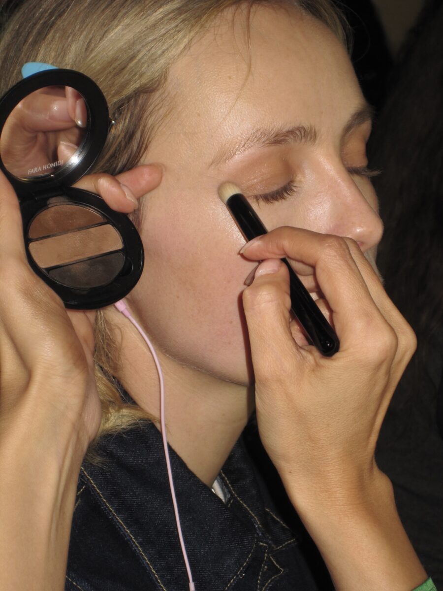
My general artistry technique for my eye looks was to make the powder shadow look more “lived in” by softening it with a cotton bud dipped in a cream eye makeup remover. This immediately made the eyeshadow look revitalized and almost like a part of the skin, rather than sitting on top of it. I decided to make a cream shadow that mimicked this refined look, in one easy swipe!
Your artistry has always leaned into eyes that feel real, worn-in and lived-in. How important was it for you not to create a crease-proof formula? What finish are you hoping people achieve when they wear these shadows? When you were developing it, what felt non-negotiable in terms of formula and performance?
Making this product as a non-crease proof formula was non negotiable to me because I wanted this to move with you, and look alive and have a malleable feel. My Cream Cashmere Soft Shadow formula is so easy to apply with even your fingers, or the Blur Brush I custom created for it. The formula is so forgiving and healthy looking on mature skin which was a big focus for me when creating the finish. The cream shadows currently on the market set and dry down quickly and emphasize texture so they aren’t conducive to layering or shaping, once they set, they can’t be manipulated. I wanted to change that narrative of 24 hour budge-free wear and let the industry know that creasing is sexy and gives a slept in look that is so attractive!
We love that pop of blue. For those who feel hesitant stepping beyond neutrals, what’s your advice? And what’s your favourite way to wear and apply this colour?
I honestly think the beauty community is hungry for a pop of blue for the first time in decades! However, for someone who is a bit hesitant on going full color, I think the best way is to begin incorporating the blue into their routine is to mix the browns with the blue to get a beautiful greige-tone which is inherently cool and less loud. And then work their way up to pushing the brightness of blue, over time. My favorite way to apply the color is to use the Blur Brush for an overall wash using the shade Lune, and then using the other shades for adding depth or strategic pops. I love using my finger at the end to swipe and shape for softer edges.
Finally, what makes these shades and this formula unmistakably Fara Homidi?
These shades are unmistakably Fara Homidi because as always, you will see them reflected in my editorial work for the past several years. I had been mixing shades to get to these colors, but now they are available in two beautiful compacts and are such wearable color ways! Also it’s worth noting, the colors are much more cool toned than what you will find on current beauty shelves!
Words – Sofia Ferreira


