

In the UK, nine out of ten adults aren’t getting the nutrients they need, with more than half of daily meals made up of ultra-processed foods. The supplement category should, in theory, offer solutions, but instead, it often offers confusion.
“There’s a lot of noise,” says Emily Jeffrey-Barrett, founder of Among Equals. “Bold claims, big promises, not always a lot of evidence behind them. And when everyone’s shouting, no one’s listening.”
That insight became the starting point for Among Equals’ latest project: a comprehensive rebrand for Tonic, the UK-based supplement company on a mission to provide “everything you need, nothing you don’t”. Rather than layering on more visual wellness tropes, the studio chose a different strategy altogether — illumination.
“The supplement space has a trust problem,” Jeffrey-Barrett explains. “What struck us about Tonic was that the product genuinely had the substance to back it up.
“Evidence-led, properly formulated, no filler. So the challenge wasn’t inventing credibility. It was making sure the brand cut through in a category that trains people to be sceptical.”
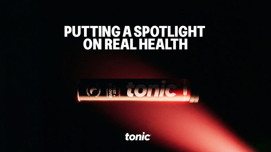
The concept of light began as a provocation. What if, instead of adding to the noise, the brand simply revealed what mattered?
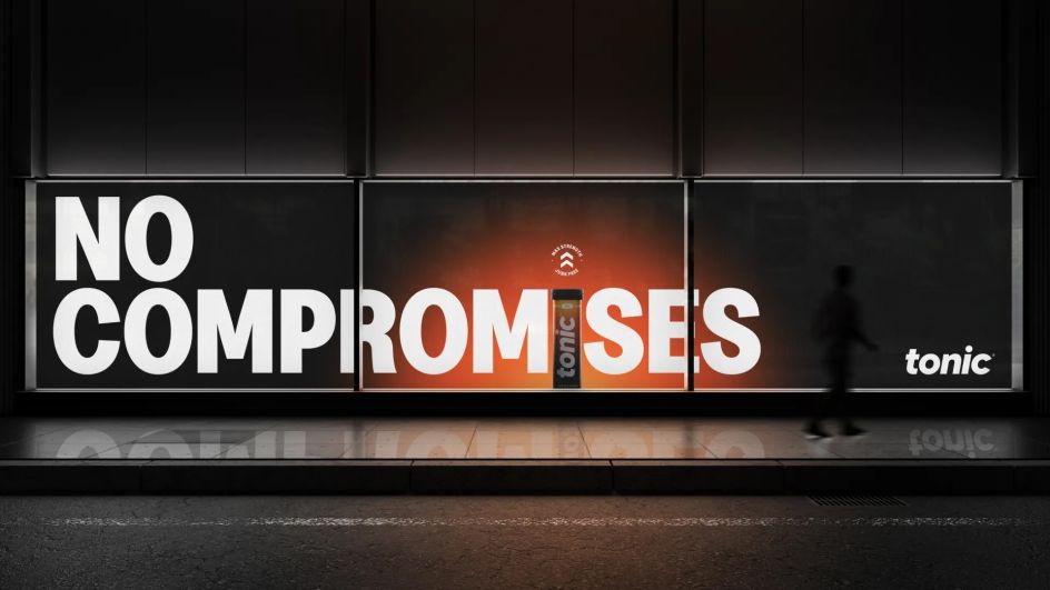
“It started as this idea of clarity as a superpower,” Emily adds. “In a space full of smoke and mirrors, Tonic would just turn the lights on.”
From metaphor, light evolved into a practical design system, not through decorative gradients or ethereal glows already common in wellness branding. Among Equals instead developed a high-contrast visual language that behaves like illumination, spotlighting key ingredients, guiding the eye and stripping away distraction.
“It gave us discipline,” says design director Fee Walter. “Every design decision had to pass a simple test: does this illuminate or does this add noise? If it didn’t clarify, it didn’t stay.”
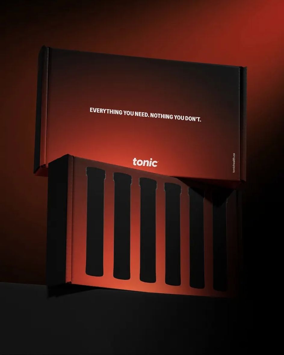
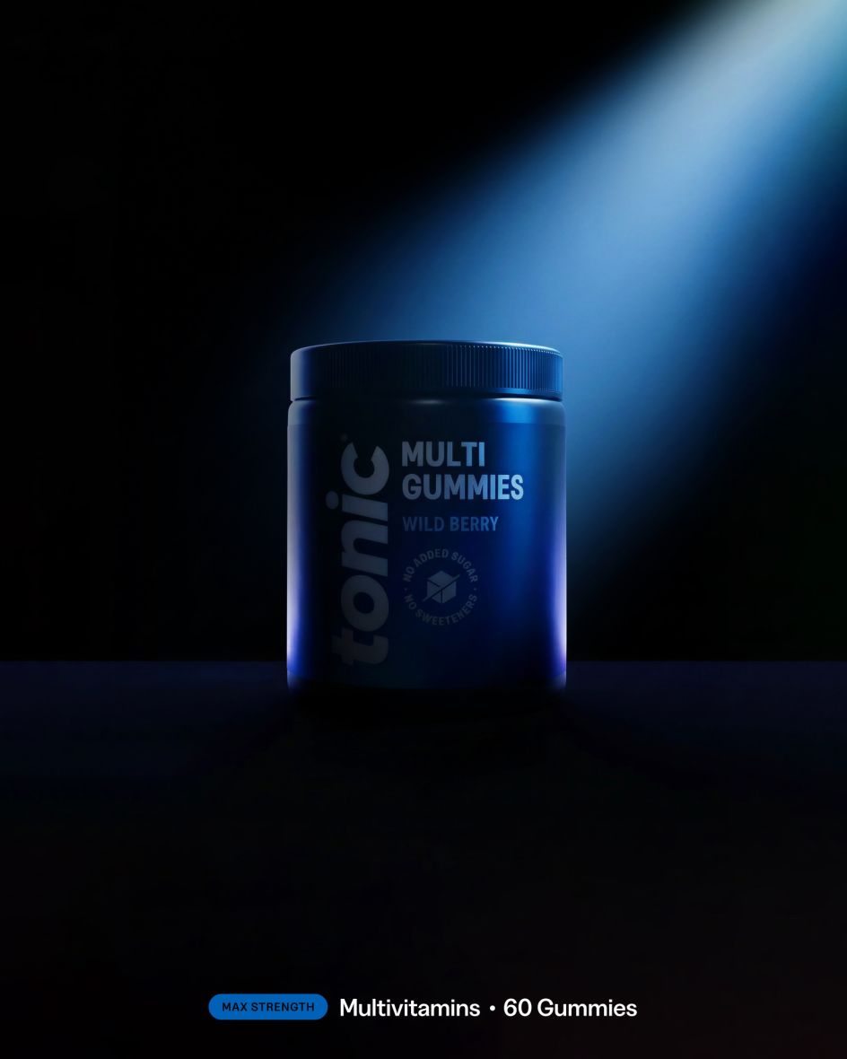
Across packaging, gradients are functional rather than ornamental, creating hierarchy and drawing focus to essential information. Digitally, the same principle becomes wayfinding.

A significant part of the work involved actively resisting category convention. When the team mapped out the competitive landscape, a pattern quickly emerged.
“It was so homogeneous,” says Emily. “Muted pastels, ‘natural’ greens, soft ambient glow. It’s everywhere – which means it’s nowhere. It all blurs into one.”
Among Equals deliberately pushed in the opposite direction. The gradients are bold and high-impact, designed to hold their own on shelf and in-feed against larger competitors. The aim wasn’t to soothe but to stop.
Typographically, the studio also avoided the safe geometric sans-serifs that dominate the space. Instead, they retained the authority of sans-serif type but scaled it up, giving it presence and voice.
“It reads less like a medical label and more like a brand that knows what it’s talking about and wants you to understand it too,” Emily says.
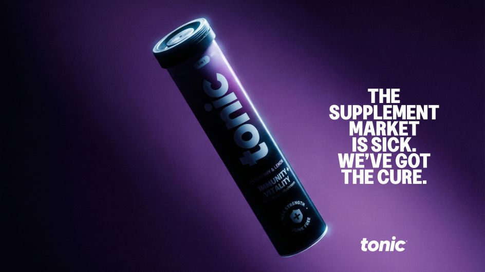
Small details signalled this shift, like removing the original atom-shaped ‘o’ in the wordmark in favour of a cleaner, more confident expression, developed in collaboration with designer Rob Clarke. Restraint became emblematic of the broader system in which trust is earned through clarity, not cleverness.
Balancing scientific credibility with accessibility was central to the project. In their category deep-dive, Among Equals found two extremes: hyper-clinical brands that felt cold and impenetrable, and aspirational wellness brands built on mood rather than evidence – neither of which felt right for Tonic.
“Sunna and the team had built something genuinely evidence-led,” Emily explains. “Our job wasn’t to prove the science – it was to make it feel inviting. Trustworthy, but warm. Confident, but not exclusive.”
This philosophy shaped the information architecture as much as the visuals. The studio worked closely with Tonic to understand dosing, ingredient interactions and the difference between meaningful claims and marketing fluff.
“There’s a lot of technical language in this space that sounds credible but doesn’t actually tell you much,” Emily says. “Impressive percentages. Long ingredient lists. Claims that are technically true but practically meaningless. We wanted Tonic to do the opposite.”
Both the packaging and digital content are built around hierarchy and plain-speaking explanations, with nothing buried in small print or dressed up.
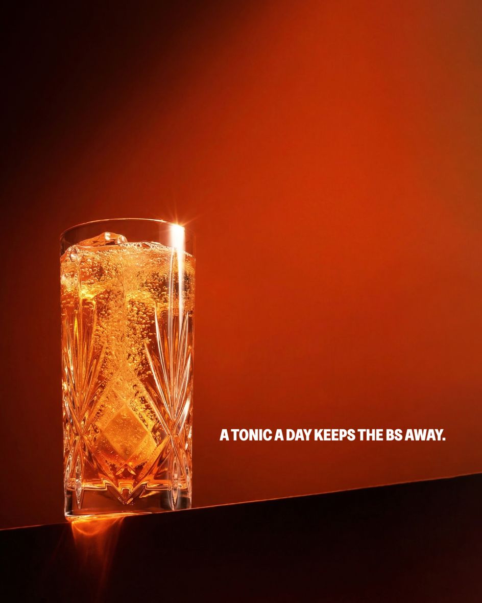
The new identity now spans packaging, digital platforms and broader brand communications, but beyond its visual distinctiveness, what sets the project apart is its ideological position. The supplements aren’t framed as aspirational enhancements or biohacking shortcuts. Tonic positions itself as democratic and essential, or, in other words, optimal health made accessible.


