


Apart from “Is that a raindrop I felt,” “Can I really just throw this cup on the ground” and “When will I finally crest Doomsday Hill,” Bloomsday runners often can’t help but pine over a single, essential question: What will this year’s shirt look like?
At some point after the race, between the aching knees and the gratifying feeling that comes after trekking 7.46 miles, Bloomies have looked at their finisher shirt and either loved, hated or felt indifferent toward the garment meant to encapsulate the heart, soul and distinctive atmosphere of the annual race.
To gauge Spokanites’ favorite Bloomsday shirts across the 49 – soon to be 50 – that have been released, The Spokesman-Review set up an online poll asking people to vote on their favorite and then explain why.
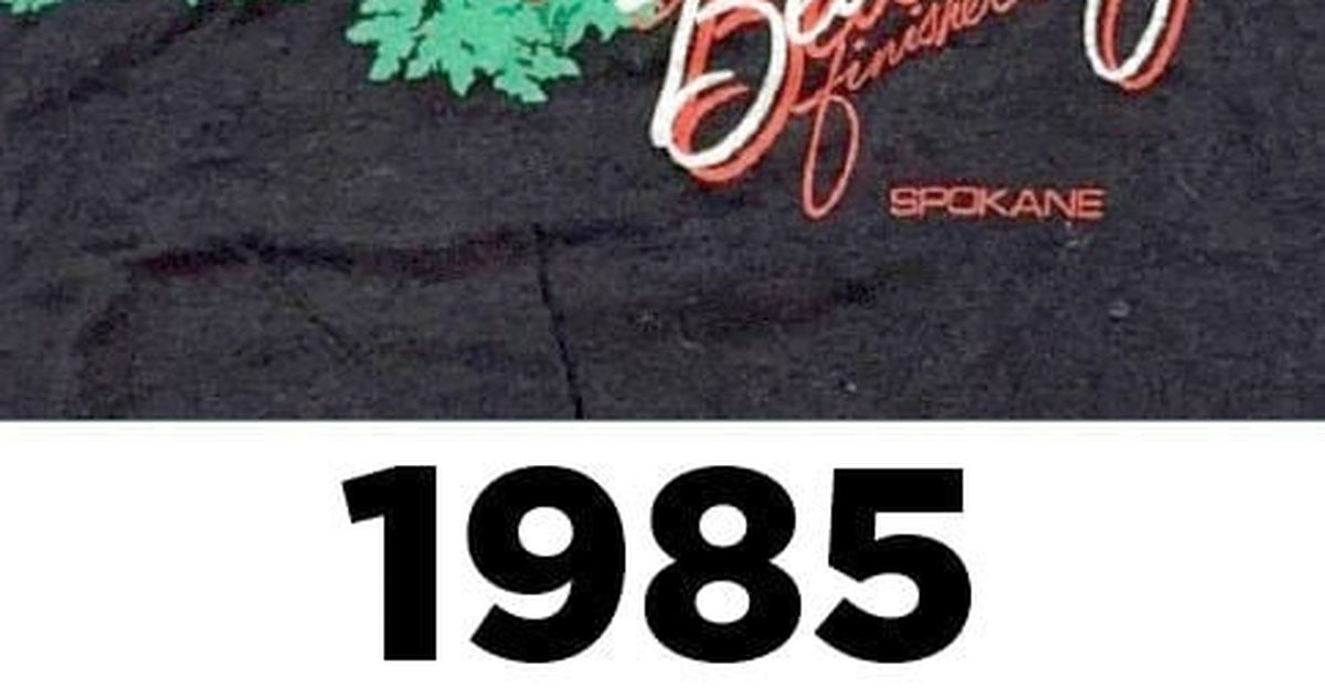
As of 9 p.m. Saturday, Ken Spiering’s 1996 shirt pulled ahead with 12.3% of the vote, while Brian Henderson’s 1985 shirt is in second with 9%.
Spiering’s shirt from 1996 depicts flattened water cups along a yellow line. The pools of water from the crumpled cups reveal, as one respondent said, “a hidden message” and is “an actual part of the race that everyone experiences.”
The shirt is also Bloomsday founder Don Kardong’s favorite. He described it as extremely clever.
Kardong said for the first 15 or so years, members of the Bloomsday board didn’t hold a competition for the finisher shirt. They selected an artist with whom they were already working and asked them to create a design.
Once the competition began, somewhere in the early 1990s, Kardong estimated about 100 artists a year submitted shirt designs. Today, that number is closer to 300.
When Bloomsday first began in 1977, race officials ordered 1,200 shirts. This year, they ordered about 45,000.
As far as what goes into a winning shirt design, Kardong said they don’t have a specific formula.
“We’re looking for something unique every year,” Kardong said. “So typically, we get a lot of shirts with the Pavilion and Clock Tower, and we’ve used that sometimes, but we’re usually looking for something a little bit different.”
Kardong and others decided a shirt for finishers would be a good idea after paying close attention to a 6-mile road race that once occurred on the South Hill and the famous Peachtree Road Race in Atlanta.
Hiding what the finisher shirt looks like, Kardong said, is a task that developed organically over the first few years and is now a special Bloomsday tradition. Due to its storied history, Kardong was careful not to reveal any shirt secrets before the day of the race.
He did divulge that the
50th anniversary shirt has a “very good design” and he’s optimistic that people will like it.
Voters’ other favorite shirt, Brian Henderson’s from 1985, shows a cluster of red and white flowers plastered over a black background. One voter described it as a “delicate but strong and beautiful design,” while others pointed out the red running shoes that subtly take the place of flowers along the stem of a plant.
In total, Henderson designed seven Bloomsday T-shirts between 1978 and 1987. He even created the official Bloomsday logo and spent years making 90 medals for the first-, second – and third -place finishers in each age group.
Henderson died of lung cancer in 1995, but his wife, Candice Henderson , continued making those medals for the next 15 years. Eventually, the time-consuming process of making 90 medals every year became a bit too much for her to handle. But it was something she wanted to do because “it was Brian’s thing, and it was the one thing that was consistent.”
Candice Henderson said five out of the seven shirts that her husband created had something to do with flowers. Because he was such a perfectionist, the process of creating a T-shirt, from initial conception to the final product, was lengthy and arduous.
She said they used to have a designated drafting table in their old house next to a sprawling window that let sunlight flood in and allowed Henderson to peer down at the verdant greenery outside to gain inspiration.
Beginning after the second Bloomsday in 1978, Candice Henderson said she and her husband became avid runners and used their lunch breaks to run around together in Riverfront Park. She described her husband as soft-spoken, kind with their twin daughters and more of a thinker than a talker. Not only that, but the man also “dressed like a million dollars” and often wore interesting, colorful ties.
While it’s been 30 years since her husband died, she was happy to know people still appreciate the shirts he created back in the ’80s. She said he never got much recognition for his work when he was alive, but “hopefully he’s looking down on us saying, ‘Hey, that’s great.’ ” Even though, she said, he never would have bragged about his work.
“It just was tragic that he never saw any of his (seven) grandkids,” Candice Henderson said. “That’s what I think about. You know, we all suffered, we all grieved. But his loss was the biggest loss.”
Wedged between Henderson’s 1985 shirt and his 1987 shirt is Molly Quinn’s 1986 finishers shirt. Quinn, who worked as an artist for the Spokesman-Review starting in 1991 and now freelances for the newspaper, was in art school in southern California when she was asked to make the 1986 Bloomsday T-shirt.
Her mother, Sylvia Quinn, was Bloomsday race director at the time, so she admits that probably had something to do with her selection.
“I can’t remember if I was competing for it,” she said. “Or if it was just, you know, nepotism, but I was really lucky to be able to do it.”
Her shirt depicts a running figure, made of broad brushstrokes, immersed in a box of colorful teal and purple pastels, which was quite “in vogue” at the time. She received $500 from Bloomsday for her work. Today, the prize is $1,000.
She said she either inadvertently or purposefully drew inspiration for her shirt by studying a Japanese art style called Sumi-e, or ink-and-brush painting. Focused on capturing the essence of a subject instead of worrying about precise realism, this art form is both minimalistic and monochromatic.
Out of all 49 previous Bloomsday shirts, Quinn said her favorite is the one from 2015.
“Letters made more abstract with the blooms, makes a pretty interesting, impactful design,” Quinn said.
Much like Quinn, John Mujica , a graphic design instructor at Spokane Falls Community College, considers 2015’s shirt to be his favorite.
The shirt has large, blocky mustard-colored letters running vertically down the shirt that spell out Bloomsday overlayed on a navy blue background. The two O’s in “Bloomsday” are supposed to be flowers. Admittedly not a huge fan of bright colors, Mujica said this is one of the only shirts he could imagine wearing out and about.
“I like that one because it’s super modern, super simplistic,” Mujica said. “I’m a big fan of typography, so I like the abstract typography and the replacement of the ‘O’s’ for lilac leaves. I like the shirt as navy blue.”
He isn’t thrilled about all the previous shirts that use the Pavilion, clock tower and Monroe Street Bridge. But the biggest thing for him when it comes to what he would and wouldn’t wear in public boils down to its color.
Along with Mujica, Katrina Butler, also a graphic design instructor at SFCC, went to the Northwest Museum of Arts and Culture to check out the “14 Million Miles: 50 Years of Bloomsday” exhibit. The Bloomsday exhibit at the MAC has vintage photographs, old race logs and all 49 previous Bloomsday shirts.
Butler enjoyed the T-shirt designed in 2022 the most. It depicts downtown Spokane, including the clocktower, Pavilion and Monroe Street Bridge, inside the year “2022.” The background is a salmon orange.
“The imagery of Spokane is woven into the numbers itself,” Butler said. “All of that main iconography that is so very Spokane is there within one image and one shot.”
To Mujica, though, the shirt is somewhat cliche. Evidently, there’s a shirt for everyone.
“The more simple, easy-to-read, nice contrast, nice color usage with both the chosen fabric and the color of the design is, for me, that navy blue,” Mujica said. “It’s left to the interpretation of the designer to be able to communicate visually to a wider group of people.”
In 2001, Steve Merryman of Sigma Graphics finally caught his big break. He had been doing advertising work for Bloomsday since 1995 and submitted a finisher’s T-shirt into the competition every year, to no avail.
When his intern, Matt Milligan, designed the winning T-shirt in 2000, Merrymen decided to step up his game.
“I was grumbling about that, and he (Milligan) was pretty pleased with himself,” Merryman said. “Then I struck back in 2001. … I was on a winning streak for four more years, and then I haven’t had one since.”
His 2001 finisher shirt showcases pink stick figures outlined by yellow, encased in a blue background. His goal was to find a way to present a genderless running figure in an energetic, colorful and unique way.
The first couple times he won the competition, Merryman said Bloomsday would send him the wrong size shirt. So one year, he decided to participate in the race so that he could get a shirt that fit. It became a “running joke” among his friends that he must’ve won the T-shirt competition if he was doing Bloomsday.
“There’s the military group doing the race while carrying the flag, and they’re all in line doing their chants,” Merryman said. “That was pretty cool. And all the people pushing strollers. It’s just a microcosm of life in the United States, with all different sorts of people. It was fun to see, but it was hard on my legs.”